A look back at the evolution of the DESMOND logo
As part of our DESMOND 20th Anniversary, the Creative Team at the Leicester Diabetes Centre, share with us - ‘A look back at the evolution of the DESMOND logo’
Over the last 20 years, the DESMOND identity has seen many changes and developments as the brand has grown and established itself.
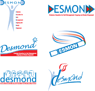
In 2003, a creative agency was approached to give the innovative new diabetes self-management course its identity.
Here is what they came up with! If you look closely, you can spot some features of the DESMOND logo we know today.
After some alterations were made and ideas combined, the first look of DESMOND was completed.
Already in the DESMOND blue we all know so well with a splash of red, the design focused around the key element.
The key to the rusty locks was integral to the DESMOND story and is still referred to by Educators and Trainers today. Alongside this, they included the acronym that the DESMOND name originates from.
After four successful years of the DESMOND brand growing, it was time to refine the logo.
Like many other identities, its name had outgrown the acronym it was developed from. This was dropped from the design, giving it a cleaner look.
Alongside this the font was made heavier and the key shrunk to allow for a tighter, bolder, and more powerful identity.
We are now looking at a logo that we recognise and one that is not too dissimilar to the logo we use today.
Five years later, the identity was once again subtly refined. The DESMOND family was growing and its sub brands expanding.
The logo was contained by a bounding box and the colours reversed, giving it a stamp like quality.
This logo was used amongst its many sub brands to proudly show they were a DESMOND product.
This is the DESMOND brand that can be seen across courses, curriculums, as well as online today.
In this, its 20th year, we would like to celebrate DESMOND by using a special logo created for the occasion.
This 20th anniversary logo can be used in your email signatures, PowerPoints, and as backgrounds for your online meetings.
We hope you have enjoyed this trip down memory lane and can see how this logo represents the strength of the DESMOND brand and how it has grown over the years.
To download your 20th anniversary logo toolkit, please click here.


